Шаблоны форм авторизации html css. Отправка данных формы
A tutorial on how to create a switching login and registration form with HTML5 and CSS3.
In this tutorial we are going to create two HTML5 forms that will switch between login and registration using the CSS3 pseudo class :target . We will style it using CSS3 and an icon font. The idea behind this demo is to show the user the login form and provide a link to “switch” to the registration form.
Note that this is for demo purpose only, it will only work in browser supporting the:target pseudo class, and you should not use this code on a live website without providing solid fallback.
In the following, we will be going through Demo 1.
The HTML
In the HTML, we will put both forms, hiding the second one with CSS. Here is the code, I’ll explain some of the interesting parts later.
We’ve added some HTML5 goodness here and used some of the new inputs. The input type=password
automatically hides what the user is typing and replaces it with dots (depending on browser). The input type=email
enables the browser to check if what the user entered has the format of a valid email address. We’ve also used the require=required
attribute; browsers that support this attribute will not let the user submit the form until this field is filled, no JavaScript required.
The autocomplete=on
attribute will prefill values based on earlier user input. We also used some nice placeholders for the inputs that will show some guiding value when the input is not filled.
Now the two tricky parts. You might have noticed the two links at the top of the form. This is a little trick that will make our form behave nicely when playing with anchors, so that it won’t “jump” on long pages when we click on the switching link and trigger the:target pseudo-class.
The second little trick is related to the use of the icon font. We will be using a data-attribute to display the icons. By setting data-icon=”icon_character” with the according character in the HTML we will just need one CSS attribute selector to style all the icons. Read more about this technique on 24 Ways: Displaying Icons with Fonts and Data- Attributes .
The CSS
For the clearness of the code in this tutorial, I will omit all the vendor prefixes, but you will, of course, find them in the files. Once again, I’m using some pretty advanced CSS3 tricks that might not work in all browsers. Let’s get started.
Styling both forms using CSS3
First, let’s give our two forms some general styling for the container.
#subscribe, #login{ position: absolute; top: 0px; width: 88%; padding: 18px 6% 60px 6%; margin: 0 0 35px 0; background: rgb(247, 247, 247); border: 1px solid rgba(147, 184, 189,0.8); box-shadow: 0pt 2px 5px rgba(105, 108, 109, 0.7), 0px 0px 8px 5px rgba(208, 223, 226, 0.4) inset; border-radius: 5px; } #login{ z-index: 22; }
We’ve added a nice box shadow that’s made of two shadows: an inset one to create the inner blue glow, and an outside shadow. We’ll explain the z-index in a bit.
In the following we will style the header with some background clipping:
/**** general text styling ****/ #wrapper h1{ font-size: 48px; color: rgb(6, 106, 117); padding: 2px 0 10px 0; font-family: "FranchiseRegular","Arial Narrow",Arial,sans-serif; font-weight: bold; text-align: center; padding-bottom: 30px; } /** For the moment only webkit supports the background-clip:text; */ #wrapper h1{ background: -webkit-repeating-linear-gradient(-45deg, rgb(18, 83, 93) , rgb(18, 83, 93) 20px, rgb(64, 111, 118) 20px, rgb(64, 111, 118) 40px, rgb(18, 83, 93) 40px); -webkit-text-fill-color: transparent; -webkit-background-clip: text; } #wrapper h1:after{ content:" "; display:block; width:100%; height:2px; margin-top:10px; background: linear-gradient(left, rgba(147,184,189,0) 0%, rgba(147,184,189,0.8) 20%, rgba(147,184,189,1) 53%, rgba(147,184,189,0.8) 79%, rgba(147,184,189,0) 100%); }
Note that at this moment only webkit browsers support background-clip: text , so we will create a stripped background only for webkit here, and clip it to the text to add the stripes to the H1 title. Since the background-clip: text property currently only works in Webkit browsers, I decided to go only with the webkit prefix. That’s the reason why I split the CSS declaration into two parts, and use a webkit prefixed gradient only. Only using the –webkit- prefix is bad practice, it’s only for demo purpose, and you should never do this on real a website! That’s also where the -webkit-text-fill-color: transparent comes in handy: it enables us to only have a transparent background on the webkit browsers, all the other ones will ignore it and give us the provided text color fallback.
We also created a fading line under the title with the help of the:after pseudo-class. We use a 2px height gradient and fade the background to 0 opacity at both ends.
Now let’s style our inputs and give them a nicer look.
/**** advanced input styling ****/ /* placeholder */ ::-webkit-input-placeholder { color: rgb(190, 188, 188); font-style: italic; } input:-moz-placeholder, textarea:-moz-placeholder{ color: rgb(190, 188, 188); font-style: italic; } input { outline: none; }
First we style the inputs, and remove the outline. But be careful here; the outline helps the user know which input is focused, so if you remove it, you should provide some:active and:focus states for the inputs.
/* all the input except submit and checkbox */ #wrapper input:not(){ width: 92%; margin-top: 4px; padding: 10px 5px 10px 32px; border: 1px solid rgb(178, 178, 178); box-sizing: content-box; border-radius: 3px; box-shadow: 0px 1px 4px 0px rgba(168, 168, 168, 0.6) inset; transition: all 0.2s linear; } #wrapper input:not():active, #wrapper input:not():focus{ border: 1px solid rgba(91, 90, 90, 0.7); background: rgba(238, 236, 240, 0.2); box-shadow: 0px 1px 4px 0px rgba(168, 168, 168, 0.9) inset; }
Here we used the:not pseudo class, to style all inputs, except the checkbox. I provided a:focus and:active state, since I decided to remove the outline.
And now the fun part: the icon font. Since we can’t use:before and:after pseudo classes on inputs, we’ll have to cheat a little bit: we’ll add the icon to the label, and then place it in the input. I’m using the fontomas library which puts together some nice icons. You can rearrange them to set the icon to a specific letter. Remember the data-icon attribute? It’s where you should put the letter. I used data-icon=’u’ for user, ‘e’ for email, ‘p’ for password. Once I chose the letters, I downloaded the font, and used the fontsquirrel font generator to transform it into a @font-face compatible format.
@font-face { font-family: "FontomasCustomRegular"; src: url("fonts/fontomas-webfont.eot"); src: url("fonts/fontomas-webfont.eot?#iefix") format("embedded-opentype"), url("fonts/fontomas-webfont.woff") format("woff"), url("fonts/fontomas-webfont.ttf") format("truetype"), url("fonts/fontomas-webfont.svg#FontomasCustomRegular") format("svg"); font-weight: normal; font-style: normal; } /** the magic icon trick ! **/ :after { content: attr(data-icon); font-family: "FontomasCustomRegular"; color: rgb(106, 159, 171); position: absolute; left: 10px; top: 35px; width: 30px; }
Yeah, that’s it folks, you don’t need to have a class for each icon. We used content: attr(data-icon) to retrieve the letter from the data-icon attribute, so we only have to declare the font, choose a nice color and position it.
Now let’s style the submit button for both forms.
/*styling both submit buttons */ #wrapper p.button input{ width: 30%; cursor: pointer; background: rgb(61, 157, 179); padding: 8px 5px; font-family: "BebasNeueRegular","Arial Narrow",Arial,sans-serif; color: #fff; font-size: 24px; border: 1px solid rgb(28, 108, 122); margin-bottom: 10px; text-shadow: 0 1px 1px rgba(0, 0, 0, 0.5); border-radius: 3px; box-shadow: 0px 1px 6px 4px rgba(0, 0, 0, 0.07) inset, 0px 0px 0px 3px rgb(254, 254, 254), 0px 5px 3px 3px rgb(210, 210, 210); transition: all 0.2s linear; } #wrapper p.button input:hover{ background: rgb(74, 179, 198); } #wrapper p.button input:active, #wrapper p.button input:focus{ background: rgb(40, 137, 154); position: relative; top: 1px; border: 1px solid rgb(12, 76, 87); box-shadow: 0px 1px 6px 4px rgba(0, 0, 0, 0.2) inset; } p.login.button, p.signin.button{ text-align: right; margin: 5px 0; }
The trick here is to use the box-shadow in order to create some extra borders. You can only use one border, but as many box-shadows as you want. We will use the length value to create a “fake” second white border, 3px wide, with no blur.
Then we’ll style the checkbox, nothing very special here:
/* styling the checkbox "keep me logged in"*/ .keeplogin{ margin-top: -5px; } .keeplogin input, .keeplogin label{ display: inline-block; font-size: 12px; font-style: italic; } .keeplogin input#loginkeeping{ margin-right: 5px; } .keeplogin label{ width: 80%; }
We will style the bottom of the form using repeating linear gradients to create a striped background.
P.change_link{ position: absolute; color: rgb(127, 124, 124); left: 0px; height: 20px; width: 440px; padding: 17px 30px 20px 30px; font-size: 16px ; text-align: right; border-top: 1px solid rgb(219, 229, 232); border-radius: 0 0 5px 5px; background: rgb(225, 234, 235); background: repeating-linear-gradient(-45deg, rgb(247, 247, 247) , rgb(247, 247, 247) 15px, rgb(225, 234, 235) 15px, rgb(225, 234, 235) 30px, rgb(247, 247, 247) 30px); } #wrapper p.change_link a { display: inline-block; font-weight: bold; background: rgb(247, 248, 241); padding: 2px 6px; color: rgb(29, 162, 193); margin-left: 10px; text-decoration: none; border-radius: 4px; border: 1px solid rgb(203, 213, 214); transition: all 0.4s linear; } #wrapper p.change_link a:hover { color: rgb(57, 191, 215); background: rgb(247, 247, 247); border: 1px solid rgb(74, 179, 198); } #wrapper p.change_link a:active{ position: relative; top: 1px; }
Now you’ll notice that we’ve got two nice forms, but we really want only one to show at a time. So now is time for some animations!!
Creating the switching animation
The first thing to do is to hide the second form by setting the opacity to 0:
#register{ z-index: 21; opacity: 0; }
Remember that our login form had a z-index of 22? We will give the second form a z-index of 21, to put it “under” the login form.
And now the really good part: switching the forms using the:target pseudo class. What you really have to understand about:target, is that we will use anchors to make the transition. The normal behavior of an anchor link, is to jump to the target in the page. But we don’t want to jump anywhere, we only want to switch the forms. And here comes our trick using the two links at the top of the page. Instead of directly linking to the second form, and risking getting a “jumping” effect, we actually put the two links at the top of the page and give them display: none . This will avoid any page jump. Credit where credit’s due: I found this trick on CSS3 create (in French).
#toregister:target ~ #wrapper #register, #tologin:target ~ #wrapper #login{ z-index: 22; animation-name: fadeInLeft; animation-delay: .1s; }
So this is what happens: when we click on the Join us
button, we trigger the #toregister. We then do the animation, by using the sibling selector ~ to find our #register element. We use an animation called fadeInLeft
. Since we “hide” the form using zero opacity, we will use an animation that fades in, to make it appear. We’ve also changed the z-index, to make it appear on top of the other form.
The same happens for the other form.
And here is the code for the animation. We are using the CSS3 animation framework from Dan Eden and adapted it for this tutorial.
Animate{ animation-duration: 0.5s; animation-timing-function: ease; animation-fill-mode: both; } @keyframes fadeInLeft { 0% { opacity: 0; transform: translateX(-20px); } 100% { opacity: 1; transform: translateX(0); } }
The form that is “disappearing” will have another animation which will make it fade out to the left:
#toregister:target ~ #wrapper #login, #tologin:target ~ #wrapper #register{ animation-name: fadeOutLeftBig; } @keyframes fadeOutLeft { 0% { opacity: 1; transform: translateX(0); } 100% { opacity: 0; transform: translateX(-20px); } }
You can now use other animations from Dan Eden’s animate.css: just adjust your .animate class and replace the animation names. You will also find some custom animations at the end of the animate-custom.css file.
Well, that’s it folks. I hope you enjoyed the tutorial!
Please note, that in some browsers background-clip: text is not supported. In Internet Explorer 9 the transitions and animations don’t work, so there will be no fancy form switching. In Internet Explorer 8 and below the:target pseudo-class is not supported, so it won’t work at all (you’ll just see the login form).
В формате данного урока создадим форму авторизации на CSS , покажу, как подключать шрифтовые иконки, каким образом задавать прозрачность у элементов, задействуем в форме анимированные эффекты при наведение.
Каркас формы в HTML
Первым создаем каркас формы. Открываем заготовку html и пропишем следующий код между тегами.
Создаем блок, который будет являться контейнер для формы. Присвоим ему класс .container , в нем размещаем форму с input Первый input для ввода логина type="text" name="username" placeholder="Введите логин" , второй input type="password" name="password" placeholder="Введите пароль" принимает пароль и за ним кнопка submit . Ниже размещаем надпись для восстановления пароля, сделаем ее простой ссылкой.
Описываем в CSS элементы формы
Затем оформим данные элементы формы. Создадим дополнительную директорию CSS в которой будем размещать файлы стилей. В ней создаем файл style.css и подключаем его к нашей страничке.
Я предлагаю на задний фон поставить изображение, для этого создадим дополнительную директорию img
, и поместим в нее свое изображение. Подключаем картинку в style.css
для body
. Прописываем путь до картинки, выходим с текущей директории, заходим в папочку img
, и далее название картинки.
Body{ background-image: url("../img/bg.png"); }
A{ color: #fff; } a:hover{ text-decoration: none; }
Предадим стили контейнеру с формой .container
. Зададим ширину в 450 пик., и временно установим высоту в 500 пик. Зададим цвет #182134
, и отцентрируем ее посередине экрана margin: 250px auto 0 auto;
. Текст в нутрии блока размещаем по центру, сверху сделаем отступ в 20 пик.
Container{ width:450px; height: 500px; background-color: #182134; margin: 250px auto 0 auto; text-align: center; }
Оформим затем input для ввода логина и пароля. Что бы не затронуть кнопку, отберем их по атрибутам text и password , указываем ширину в 300 пик. , высоту в 50 пик. Текст увеличиваем на 18 пик., сделаем отступы между ними в 25 пик., закруглим углы border-radius: 4px; , текст сдвинем на 10 пик. влево.
Input,input{ width: 300px; height:50px; font-size: 18px; margin-bottom: 25px; border-radius: 4px; padding-left: 10px; }
Затем отцентруем inpyt
, для этого обернем их в дополнительный блок и присвоим класс .dws-input
. Сделаем перенос строки после кнопки, и вверху перед кнопкой вставим картинку с нашим логотипом. Для этого скопируем ее в папку img
, и пропишем к ней путь img src="img/men.png"
.

Далее опишем ее стили. Картинке присвоим ширину и высоту по 120 пик. , затем подымем ее чуть выше формы margin: -60px 0 30px 0; , делаем об водку в 5 пик. border: 5px solid #1a394f; , закругляем углы в 50%.
Container img{ width:120px; height:120px; margin: -60px 0 30px 0; border: 5px solid #1a394f; border-radius: 50%; }
Теперь опишем стили кнопки. Присвоим ей класс .dws-submit , и назначаем ей стили. Назначаем отступы, увеличим текст на 15 пик., делаем его белым, а фон кнопки синим, убираем об водку и сделаем в низу плашку, а также курсор Pointer .
Dws-submit { padding: 13px 30px; margin: 5px 0 20px 0; font-size: 15px; color: #fff; background-color: #2ca8c6; border: none; border-bottom: 4px solid #6ee9fd; cursor: pointer; }
Чтобы отцентровать инпуты и кнопку, поместим их отдельно каждый в свой блок. Опишем стили кнопке при наведении. Делаем плавный переход, цвет кнопки меняем на белый, а в тоже время шрифт будет меняться на темный.
Dws-submit:hover{ transition: all 0.5s; background: #fff; color: #2c536c; }
Сделаем, сверху нашей формы синею плашку, box-shadow: 0 -5px 0 #3adbfd; , и добавим ее к картинке box-shadow: 0 -5px 0 #3adbfd; . Сделаем фон формы немного прозрачнее, для этого пропишем этот цвет в формате RGBA .
Я пользуюсь сервисом w3schools.com , спускаемся вниз до Color Picker , в форму введем наш цвет и преобразуем его в RGB . Копируем, вставляем в стиль контейнера.
Container{ width:450px; height: 500px; background-color: rgba(24, 33, 52, 0.7); margin: 250px auto 0 auto; text-align: center; box-shadow: 0 -5px 0 #3adbfd; } .container img{ width:120px; height:120px; margin: -60px 0 30px 0; border: 5px solid #1a394f; border-radius: 50%; box-shadow: 0 -5px 0 #3adbfd; }
Для эффекта, закруглим нижние углы, для этого пропишем border-radius: 0 0 10px 10px;
.
Добавление шрифтовых иконок
Добавим иконки в виде шрифтов, переходим на сервис fontawesome.io и скачиваем их к себе на компьютер. Распакуем архив, копируем папку fonts, в которой находятся шрифты, и копируем файл стилей в директории css. Затем подключаем стили к страничке.
Отберем иконки для наших инпутов, для этого переходим на страничку Icons , первый подключим стиль для ввода логина, используем user , копируем его код f007 , и описываем его в стилях при помощи псевдоэлемента.
Подключаем шрифты font-family: "FontAwesome"; ,затем саму иконку, позиционируем ее абсолютно поля, увеличим ее на 30 пик, отцентруем и изменим цвет.
Dws-input::before{ font-family: "FontAwesome"; content: "\f007"; position: absolute; font-size: 30px; padding: 10px 0 0 7px; color: #2c536c; }
Немного подвинем текст в input - padding-left: 40px; .
Отберем вторую иконку с названием lock , копируем ее код f023 , и описываем ее стили.
Для этого отбираем второй элемент .dws-input:nth-child(2)::before{}
, и прописываем картинку content: "\f023
";.
Dws-input::before{ font-family: "FontAwesome"; content: "\f007"; position: absolute; font-size: 30px; padding: 10px 0 0 7px; color: #2c536c; } .dws-input:nth-child(2)::before{ content: "\f023"; }
Dws-input:hover::before{ color: #319ebc; transition: all 0.3s; }
А также, стили наведение для инпутов.
Dws-input input:hover{ box-shadow: 0 0 6px 3px rgba(58, 219, 253, 0.35); }
Для удобства обернем их в блок с классом .social
и опишем их стили. Изменим их цвет на белый, увеличим на 20 пик., сделаем шириной в 20 пик., и дадим отступы.
Dws-social i{ color: #fff; font-size: 20px; width: 20px; padding: 10px; }
Затем опишем стили при наведении. Сделаем белый блок, фон иконки изменим на темный, закруглим углы и при наведение отобразим курсор.
Social i:hover{ background-color: #fff; color: #1a394f; border-radius: 5px; cursor: pointer; }
Уберем высоту блока формы, которую задавали в самом начале, а в место ее добавим нижний отступ padding-bottom: 20px; .
В принцыпе и все, получилась довольно симпатичная форма, которую можно подключить на сайт и использовать для авторизации.
Пробуйте сделать на примере данного урока что нибудь свое оригинальное, тренируйтесь, и не забывайте делится данным материалом.
Login forms are everywhere on the web. Are you using the social networks? You must go through login form of some sort. Do you have an email? Did you join any forums? Did you try to leave a comment on a WordPress site? To gain access to anything on the internet, the chances are you will have to go through some sort of login process. You will probably have to register first, sign up or leave some information behind. You will have to use some sort of login form to do anything on the internet.
So what do Login Forms have to do with HTML and CSS? They are both the essential parts of the Login Forms.
HTML (HyperText Markup Language) is a standard markup language used to create web pages. HTML elements are building blocks of all websites.
CSS (Cascading Style Sheet) is a language used for describing the look and formatting of a document written in a markup language. Such as HTML!
We use HTML to build a website and CSS to make it look nice. That is what most of the users encounter while browsing the web.
We’ve made a list of 50 free login forms that you can use on your WordPress site, blog, forum or anywhere else. This is a hand-picked list by Colorlib to ensure the highest quality of the forms. Each and every form has been thoroughly tested to ensure no components are missing and source code is available with every download. Of course, you are free to use these forms for personal and commercial purposes, with no need for attribution.
Explore 2.5 Million Digital Assets including 2019’s Best WordPress Templates
2M+ items from the world’s largest marketplace for HTML5 Templates, Themes & Design Assets. Whether that’s what you need, or you’re just after a few Stock Photos – all of it can be found here at Envato Market.
DOWNLOAD NOW
WordPress Login Customizer
 The rest of the list and HTML/CSS powered login forms but here you can see the best login customizer plugin for WordPress. It comes with several defined templates that you can further tweak to match the design of your website. Thats to this plugin you can finally get rid of boring WordPress wp-admin page and create a truly unique experience for yourself and your users.
Creative Login Form

Simple yet creative login form created using HTML5 and CSS3. This form can be used as registration form as well. This is our favorite template on this list thanks to its flexibility and similarity that allows you to create
WordPress versionWe did search the internet for cool login forms but it was very difficult to find good looking ones therefore we decided to have our take on them. We would like to present 20 login forms designed and developer by Colorlib team.
Login Form 1 by Colorlib

Simple, creative and vibrant login form with a gradient background. You can use this one for all sorts of intentions, like web, mobile or desktop applications. But do get creative with it if you like.
Login Form 2 by Colorlib

Minimal and sophisticated login form by Colorlib with a gradient button with animation and a logo. Use it, alter it and have it as a nice addition to your already nifty web space.
Login Form 3 by Colorlib

A gorgeous login page with a background image with shadow and a gradient form box with login button hover effect. The only limitation that you have is your imagination, so expand your view and use Login Form 3 to its full potential.
Login Form 4 by Colorlib

Creativity knows no limits and nor does Login Form 4. Here it is, at your disposal, ready and set for you to download it and put it to some good use. Do not worry about the responsiveness either.
Login Form 5 by Colorlib

Gorgeous, clean and modern form with an option to log in with Facebook or Google. All buttons have a nice hove effect that spices up the experience.
Login Form 6 by Colorlib

If your page is already super neat and tidy, a login form should be no different. Here is one that will easily meet your expectations if minimalism is your cup of tea.
Login Form 7 by Colorlib

A form with a three-way option of logging into the account. Either it is Facebook, Twitter or email login they prefer, this is the type of a tool that you need to feature on your page. And if they do not already have an account, you can also link it with your sign up page.
Login Form 8 by Colorlib

Another contemporary, trendy and enticing login form with rounded everything. This one is especially applicable to mobile users due to its currently very popular rounded corners style.
Login Form 9 by Colorlib

If you would like to avoid the white or single-color background, this is the login form page that you should consider. Not only does it support a full image background, but it also comes with a gradient overlay and an option to log in with Facebook or Google.
Login Form 10 by Colorlib

A somewhat complete opposite compared to the previous one is Login Form 10. It almost could not be more minimalistic looking while still having this up-to-the-minute feel to it.
Login Form 11 by Colorlib

With our collection of the best HTML5 and CSS3 login forms, you save yourself time and effort (money, too). Instead of building one from scratch, here is another killer ready-to-use template for you to employ.
Login Form 12 by Colorlib

Image background with a blue shadow overlay, name, image and the must-have form, that’s what’s up with Login Form 12. There is also a cool hover effect on the login button and gives you a chance to link it with your registration form for all new users.
Login Form 13 by Colorlib

A split screen sign up form, where one half is dedicated to an image and the other half to the form. It is a free tool which you can start using this very moment. Just download the layout and go full tilt with it.
Login Form 14 by Colorlib

In this collection, we have a mixture of simplistic and those a tad more complex and advanced login forms. In short, there is something for everyone and Login Form 14 is more on the minimalistic side. But why even complicate with a login form, right? To each their own.
Login Form 15 by Colorlib

While still keeping things to the bare minimum, one cool addition to the Login Form 15 is the image banner just above the form. With this little feature, you can make the experience slightly more engaging.
Login Form 16 by Colorlib

This is a login form with a full-screen image on top of which is placed a form with username and password fields and a gradient button with hover effect. Simple and straightforward.
Login Form 17 by Colorlib

To make it appear more personal, this framed login form template is the best fit for you. It has an image side and a form side but keeps things to the very minimum while still ensuring professionalism.
Login Form 18 by Colorlib

If you like to differentiate yourself and keep things original, do consider using Login Form 18. While some enjoy login pages super basic, the others want to have some additional goodies rocking the layout. And if adding a picture is what you are after, this one is for you.
Login Form 19 by Colorlib

Vibrant, energetic and attention-grabbing, that is what this next login form based on HTML5 and CSS3 is all about. It is also fully responsive and mobile-ready, as well as compatible with all major web browsers.
Login Form 20 by Colorlib

Gradient background, black sign in button with hover effect, username and password fields along with custom text and “Forgot password?” section, yep, that’s all part of Login Form 20. Sounds overwhelming but in reality, far from it.

The form is hidden unless you click on “Login” option. Really great feature for modern websites that want to avoid having a separate page for the login form. You can display the form anywhere on your website with this powerful tool.
Download
A design for a Sign Up form using tabs and floating form labels.
Download
What was initially made to stop people from entering one person’s WordPress site, it became a really popular form due to its simplicity and neat design.
DownloadFlat Login – Sign Up Form

Once you click “Click me” button in top-right corner, you will get smooth animation that transforms this Login form to Sign up form.
DownloadLogin With Self-Contained SCSS Form

This is a form with self-contained SCSS. An extension of CSS that adds power and elegance to the basic language. It allows to use variables, nested rules, mixins, inline imports, and more.
Download
This is actually an animated Login form, with top “Hey you, Login already” transforming into the form at the bottom. Smooth animation effects.
Download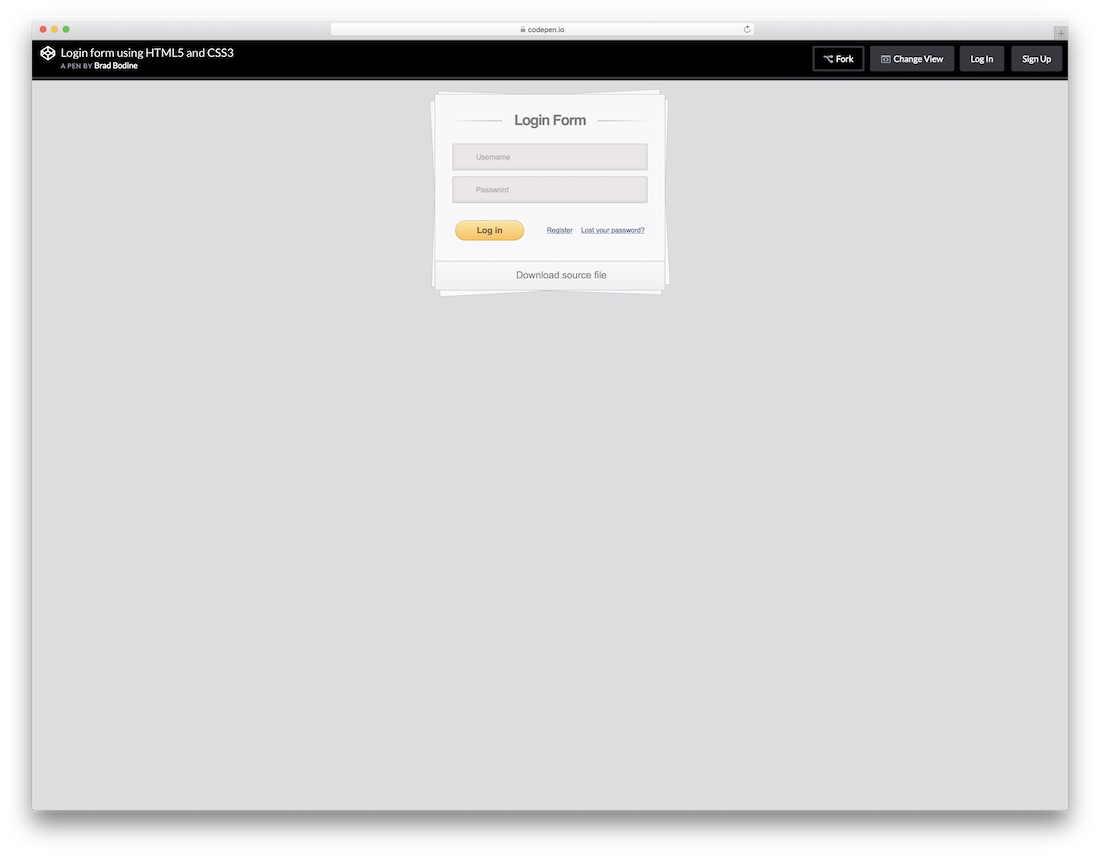
This is an example on how to create a simple login form using HTML5 and CSS3. This form uses pseudo elements (:after and:before) to create the multi page effect. These elements are rotated using the CSS3 transform property. This form uses HTML5 to make validation and submission easy.
Download
Once you enter a wrong password in this form, a nice shake effect will warn you that you did not enter the correct password. A simple and effective solution that will point out the problem of incorrect passwords.
Download
A boxy login form with a little surprise. Try “admin” as a username, and “1234” as a password, for full experience.
Download
Neat little login form. Once you click on “LOGIN” on the left side, animation effect creates neat little login form on the right. Definitely unique approach!
DownloadMaterial Design Form

Fairly simple and easy on the eye login form that you can add to your blog or any other website and spice up the experience. No need to overcomplicate with a simple thing as the login form is. Even if you are just collecting subscribers, you can also play around with this layout and get things rocking.
Bootstrap Snippet Form

Obviously, this next free HTML5 login form is based on the well-liked Bootstrap Framework. This tells you that you can expect some nice flexibility that any modern website and element must practice. Email address, password and a check box to tick if a user would like the platform to remember his or her information. Easy and to the point.

Regardless of your main web design, with things like login forms, you do not want to over complicate it. Instead, you would want to keep it simple and let it to the job, getting users to access their accounts seamlessly. You will achieve that goal with this login form with flat UI unquestionably.
Trendy UI Kits Form

From super simple login forms to those with slightly more action going on. This particular one is pretty similar compared to the last one just that you will notice a frame going all around the form. Get them to type in their names or usernames and passwords and they can enter your world of amazingness.
Dashboard CSS3 HTML5 Form

All the HTML5 and CSS3 login forms you find on this list are simple to use and effortless to attach to your web platform. This one even has a “Forgot your password?” right at the bottom for everyone who just cannot recall their passwords. The template is perfect for entering your dashboard, but you can apply it for other needs, too.
Login With Recovery Form

The title pretty much says it all; this is a neat, clean and minimal looking login form with recovery. What you also notice is that there is no traditional “box” that you are used to seeing login forms use. If you would like to make a difference, you now know which layout to choose.

A free flat login form with a stunning and elegant dark layout coupled with a green call-to-action button. Sure, you can alter the tool to your likings, but you can also employ it exactly as is and have it live on your website in a snap. Play around with its features and have it all set up the way you like it.
Transparent Login
Even a login form can be of super creative and attention-grabbing nature. While many stick to the simple and basic look, there are others who like it special and exclusive. This transparent login form will surely do the trick for you. With an image background and a form over it, this layout can follow your branding to a T.

No need to be really going too in-depth with this next login since it is pretty self-explanatory. It is compatible with the Google Chrome extension, as well as features buttons for those who are not signed up yet or lost their password. If this is the one you were looking for, then scrolling all the way this far was more than worth it.
Elegant Flat Form

A stylish flat form which you can append to your web space as a pop-up or ad as a widget on a page. Whatever the case, it will keep your professional approach intact. It is simple and easy on the eye and also has a CTA for everyone who missed signing up to your members’ area. Use it as is or improve it according to your taste.

Definitely an approach to a free login form that you should not miss. It has a feel of a coupon just that it is not if that even makes any sense. Anyhow, in the text section, you can also link this form to the signup form for those interested in creating an account. Other than that, it surely will capture their attention.

More and more website owners are implementing social logins and you can join the trend as well. This free login form with social integration is the right option to take the plunge. However, along with Twitter, Facebook and Google+ buttons, the layout also features the traditional way of signing up with an email.
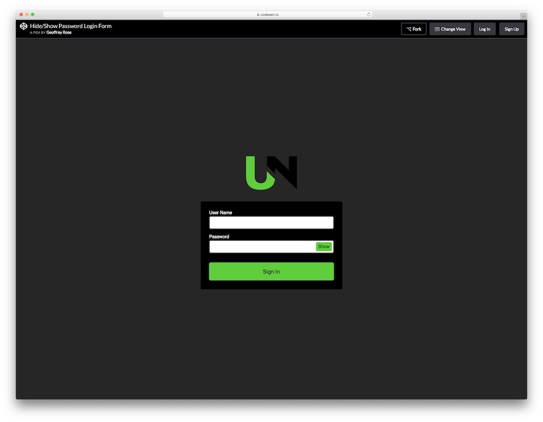
If your password is super complex, you sometimes just want to enter it in a “show” mode. Offer this same feature to all your users with the show and hide password login form. It has a stunning dark layout with green details perfect for those who dig this type of designs. Of course, feel free to make changes to it and fine-tune it according to your needs.
Log ‘N Load Animated Form

If you already practice animations and special effects on your page, keep the trend with the login form, too. Instead of creating your own one, you can simply use this striking Log ‘N Load animated form that will do the trick. Once you hover over the login button, the form reveals right in front of you. It even has a circular loading that enhances the experience.

This flat, modern and easy to use login form works great on all devices, mobile, tablet and desktop. You can also play around with different tweaks and alter the default settings to your website’s style precisely. The tool also has cool hover effects that add a touch of sophistication to the overall experience.
Login form templates aren’t there just to look beautiful, they need to be simpler and more efficient to fill out. There are many ways to design login forms. But finding the right solution for the job can be a painstaking task. To help you create great looking login page templates quickly, here are some most interesting HTML, CSS techniques that you can easily follow. Just download the template source and test it all by yourself for free!
Free Login/Register Templates
Login & Register Form
Kill two birds with one stone… The form will switch from login to register, and back, based on if the user is already “registered”. Find “registered” users in the js panel.
A simple Login Form template with Flat UI…
Disqus Like Sign-in form
Slick login form with HTML5 & CSS3
A clean and simple login form template with a round submit button and elegant focus states.
Nice and Simple Login Form
A nice and simple HTML/CSS login form template. It uses wordpress’s login system.
CSS3 Login Form Template
An amazing css3 login form template with only html, css features being used. Download and use this as you like.
Flat UI Login Form
Animated Form Switching with jQuery
A simple animated form switch with three very common forms. The idea is not to leave the page when the user goes to another form but instead make the new form appear within the same container, expanding or contracting to the dimensions of the new form.
Slick Login Form With CSS3
A minimal and slick login form template using basic HTML5 and enhancing it with some CSS3 techniques.
Pure CSS Login Form
Simple and effective dropdown login box
In this article, you will learn how to create a good looking dropdown login form template using CSS3 and a bit of jQuery.
Login Form Template with HTML and CSS
Just a simple and flat login form template…
Login
Flat UI Login Form
Custom Login Form Styling
In this tutorial we will create some modern and creative login forms using some interesting CSS techniques and HTML5 goodness.
Login Form with PHP, JQuery and CSS3
Creating an elegant login page using CSS3, Jquery + Ajax and processed by PHP.
Login/Register form with pass metter
Apple-like Login Form with CSS 3D Transforms
In this tutorial we will see how we can use the transforms to create an interesting flipping effect on an Apple-inspired form.
Login Form (Coded)
This freebie is a professional login form. The download includes the PSD file, and xHTML, Js and CSS files as well. You can use it in anyway you want. It involves some nice effects using CSS3 and javascript and I hope you enjoy it!
Login
Login form using HTML5 and CSS3
This is an example how to create a simple login form using HTML5 and CSS3.
Здравствуй, дорогой хабрадруг! В этом туториале мы научимся создавать две формы HTML5: форма входа и форма регистрации. Эти формы будут меняться друг с другом местами с помощью псевдо-класса CSS3 :target . Мы будем использовать CSS3 и шрифт с иконками. Идея этого демо в том, чтобы показать пользователю форму входа и предоставить ему ссылку “перехода” к форме регистрации.
В этом туториале я подробно расскажу о том, как создавать эффект как в Демо 1 .
HTML
Здесь мы использовали несколько приемов HTML5. Например, элемент type=password автоматически скрывает то, что пользователь печатает и заменяет символы точками или звездочками (зависит от браузера). Элемент type=email позволяет браузеру проверить правильность формата email адреса. Кроме того, мы использовали параметр require=required ; браузеры, поддерживающие данный параметр не позволят пользователю отправить форму до тех пор, пока поле не заполнено, JavaScript здесь не требуется. Параметр autocomplete=on будет автоматически заполнять некоторые поля. Мы также использовали замещающийся текст, который поможет пользователю при заполнении формы.
Теперь о двух хитрых моментах. Вы наверное заметили две ссылки в начале формы. Этот ловкий прием позволит нашей формы вести себя правильно при работе с якорями (anchors).
Второй момент связан с применением шрифта с иконками. Мы будем использовать data-attribute , чтобы отобразить иконки. Устанавливая параметр data-icon=”icon_character” с соответствующим символов в HTML, мы должны назначить лишь одно правило в CSS для установления стиля всех иконок. Подробнее об этом приеме можно почитать на сайте: 24 Ways: Displaying Icons with Fonts and Data- Attributes .
CSS
Для чистоты кода я пропущу базовые параметры (html, body и т.п.), но вы сможете найти их в исходных файлах. Повторяю, что я использую приемы CSS3, которые не будут работать во всех браузерах. Итак, давайте же приступим!Стилизуем формы, используя CSS3
Во-первых, давайте назначим нашим формам базовый стиль.#subscribe, #login{ position: absolute; top: 0px; width: 88%; padding: 18px 6% 60px 6%; margin: 0 0 35px 0; background: rgb(247, 247, 247); border: 1px solid rgba(147, 184, 189,0.8); box-shadow: 0pt 2px 5px rgba(105, 108, 109, 0.7), 0px 0px 8px 5px rgba(208, 223, 226, 0.4) inset; border-radius: 5px; } #login{ z-index: 22; }
Здесь мы назначим свойства для шапки:
/**** текст ****/ #wrapper h1{ font-size: 48px; color: rgb(6, 106, 117); padding: 2px 0 10px 0; font-family: "FranchiseRegular","Arial Narrow",Arial,sans-serif; font-weight: bold; text-align: center; padding-bottom: 30px; } /** На донный момент только webkit поддерживает background-clip:text; **/ #wrapper h1{ background: -webkit-repeating-linear-gradient(-45deg, rgb(18, 83, 93) , rgb(18, 83, 93) 20px, rgb(64, 111, 118) 20px, rgb(64, 111, 118) 40px, rgb(18, 83, 93) 40px); -webkit-text-fill-color: transparent; -webkit-background-clip: text; } #wrapper h1:after{ content:" "; display:block; width:100%; height:2px; margin-top:10px; background: linear-gradient(left, rgba(147,184,189,0) 0%, rgba(147,184,189,0.8) 20%, rgba(147,184,189,1) 53%, rgba(147,184,189,0.8) 79%, rgba(147,184,189,0) 100%); }
Замечу, что сегодня только браузеры с webkit поддерживают background-clip: text , поэтому мы сделаем полосатый фон только для webkit и привяжем его к заголовку H1. Так как параметр background-clip: text работает только в Webkit браузерах, я решил работать только со свойствами webkit. Именно поэтому я разделил CSS на две части и использовал только градиент webkit. Однако вы не должны использовать лишь webkit на своих вебсайтах! Так, например, параметр -webkit-text-fill-color: transparent позволяет нам иметь прозрачный фон, но только для браузеров webkit, все другие браузеры проигнорируют это свойство.
Мы также создали тонкую линию под заголовком с помощью элемента:after pseudo-class. Мы использовали градиент с 2px в высоту и уменьшили прозрачность по краям до нуля.
Теперь давайте позаботимся о полях ввода и придадим им приятный вид.
/**** advanced input styling ****/ /* placeholder */ ::-webkit-input-placeholder { color: rgb(190, 188, 188); font-style: italic; } input:-moz-placeholder, textarea:-moz-placeholder{ color: rgb(190, 188, 188); font-style: italic; } input { outline: none; }
Во-первых, мы стилизуем поля и уберем обводку. Но будьте осторожны: обводка помогает пользователю понять, на каком поле он находится. Если же вы уберете ее, то нужно применить свойства:active и:focus.
/* все поля исключают submit и checkbox */ #wrapper input:not(){ width: 92%; margin-top: 4px; padding: 10px 5px 10px 32px; border: 1px solid rgb(178, 178, 178); box-sizing: content-box; border-radius: 3px; box-shadow: 0px 1px 4px 0px rgba(168, 168, 168, 0.6) inset; transition: all 0.2s linear; } #wrapper input:not():active, #wrapper input:not():focus{ border: 1px solid rgba(91, 90, 90, 0.7); background: rgba(238, 236, 240, 0.2); box-shadow: 0px 1px 4px 0px rgba(168, 168, 168, 0.9) inset; }
Здесь мы использовали псевдо класс:not, чтобы стилизовать все поля, кроме чекбоксов. Кроме того, я решил убрать обводку и добавил свойства:focus и:active.
Теперь время веселиться: шрифт с иконками. Так как мы не можем использовать псевдо-классы:before и:after, мы добавим иконку в параметр label, а затем разместим в поле. Я буду использовать библиотеку fontomas . Вы можете сами сопоставить иконки с соответствующей буквой. Помните атрибут data-icon ? Именно в него нужно вставить букву. Я использовал data-icon=’u’ для логина, ‘e’ для email, ‘p’ для пароля. Как только я выбрал буквы, я скачал шрифт и использовал генератор шрифтов fontsquirrel для конвертации в формат, пригодный для @font-face.
@font-face { font-family: "FontomasCustomRegular"; src: url("fonts/fontomas-webfont.eot"); src: url("fonts/fontomas-webfont.eot?#iefix") format("embedded-opentype"), url("fonts/fontomas-webfont.woff") format("woff"), url("fonts/fontomas-webfont.ttf") format("truetype"), url("fonts/fontomas-webfont.svg#FontomasCustomRegular") format("svg"); font-weight: normal; font-style: normal; } /** магический трюк! **/ :after { content: attr(data-icon); font-family: "FontomasCustomRegular"; color: rgb(106, 159, 171); position: absolute; left: 10px; top: 35px; width: 30px; }
Вот собственно и все. Вам не требуется иметь отдельный класс для каждой иконки. Мы использовали параметр content: attr(data-icon) , чтобы получить букву из атрибута data-icon. Таким образом, нам нужно лишь назначить шрифт, выбрать цвет и разместить иконку.
Теперь назначим правила для кнопки отправки формы.
/*стилизуем обе кнопки*/ #wrapper p.button input{ width: 30%; cursor: pointer; background: rgb(61, 157, 179); padding: 8px 5px; font-family: "BebasNeueRegular","Arial Narrow",Arial,sans-serif; color: #fff; font-size: 24px; border: 1px solid rgb(28, 108, 122); margin-bottom: 10px; text-shadow: 0 1px 1px rgba(0, 0, 0, 0.5); border-radius: 3px; box-shadow: 0px 1px 6px 4px rgba(0, 0, 0, 0.07) inset, 0px 0px 0px 3px rgb(254, 254, 254), 0px 5px 3px 3px rgb(210, 210, 210); transition: all 0.2s linear; } #wrapper p.button input:hover{ background: rgb(74, 179, 198); } #wrapper p.button input:active, #wrapper p.button input:focus{ background: rgb(40, 137, 154); position: relative; top: 1px; border: 1px solid rgb(12, 76, 87); box-shadow: 0px 1px 6px 4px rgba(0, 0, 0, 0.2) inset; } p.login.button, p.signin.button{ text-align: right; margin: 5px 0; }
Трюк заключается в том, чтобы использовать box-shadow, чтобы создать несколько рамок. Естественно, вы можете использовать лишь одну рамку, но также можно и несколько. Мы будем использовать параметр length для создания “фейковой” второй белой рамки, 3px в ширину, без размытия.
Теперь стилизуем чекбокс, здесь мы ничего необычного не сотворим:
/* стилизуем чекбокс "запомнить меня"*/ .keeplogin{ margin-top: -5px; } .keeplogin input, .keeplogin label{ display: inline-block; font-size: 12px; font-style: italic; } .keeplogin input#loginkeeping{ margin-right: 5px; } .keeplogin label{ width: 80%; }
Стилизуем подвал формы, используя множественные линейные градиенты, чтобы создать полосатый градиент.
P.change_link{ position: absolute; color: rgb(127, 124, 124); left: 0px; height: 20px; width: 440px; padding: 17px 30px 20px 30px; font-size: 16px ; text-align: right; border-top: 1px solid rgb(219, 229, 232); border-radius: 0 0 5px 5px; background: rgb(225, 234, 235); background: repeating-linear-gradient(-45deg, rgb(247, 247, 247) , rgb(247, 247, 247) 15px, rgb(225, 234, 235) 15px, rgb(225, 234, 235) 30px, rgb(247, 247, 247) 30px); } #wrapper p.change_link a { display: inline-block; font-weight: bold; background: rgb(247, 248, 241); padding: 2px 6px; color: rgb(29, 162, 193); margin-left: 10px; text-decoration: none; border-radius: 4px; border: 1px solid rgb(203, 213, 214); transition: all 0.4s linear; } #wrapper p.change_link a:hover { color: rgb(57, 191, 215); background: rgb(247, 247, 247); border: 1px solid rgb(74, 179, 198); } #wrapper p.change_link a:active{ position: relative; top: 1px; }
Сейчас вы видите, что у нас две приятные формы, но ведь мы хотим, чтобы отображалась только лишь одна из них. Пришло время анимации!
Создаем анимацию
Первое, что мы сделаем, мы спрячем вторую форму, назначив opacity на 0:#register{ z-index: 21; opacity: 0; }
Помните, что форма входа имеет параметр z-index: 22? Второй форме мы назначим этот параметр на 21, чтобы поставить его “под” форму входа.
Теперь самое интересное: меняем формы местами, используя псевдо класс:target. Вам нужно понять одну вещь по поводу:target: для перемещения мы будем использовать якоря. Нормальное поведение якоря - прыжок на определенный элемент страницы. Но мы не хотим этого, мы лишь хотим поменять формы местами. И тут приходит на помощь наш трюк с использованием двух ссылок в начале страницы. Вместо того, чтобы направить нас прямо на вторую форму, рискуя испытать эффект “прыжка”, мы придадим ссылкам параметр display: none . Это поможет избежать прыжков. Я обнаружил этот трюк на сайте: CSS3 create (французский язык).
#toregister:target ~ #wrapper #register, #tologin:target ~ #wrapper #login{ z-index: 22; animation-name: fadeInLeft; animation-delay: .1s; }
Вот, что происходит: когда мы кликаем на кнопку Присоединиться
, мы направляемся на #toregister. Затем происходит анимация и лишь потом переходим на элемент #register. Мы используем анимацию под названием fadeInLeft
. Так как мы “прячем” форму, используя нулевую прозрачность, мы применим анимацию, которая будем постепенно появляться. Мы также изменили z-index, чтобы она появилась поверх другой формы. То же самое происходит для другой формы same happens for the other form.
Вот код для анимации. Мы использовали CSS3 animation framework от Dan Eden и адаптировали этот фреймворк под наш туториал.
Animate{ animation-duration: 0.5s; animation-timing-function: ease; animation-fill-mode: both; } @keyframes fadeInLeft { 0% { opacity: 0; transform: translateX(-20px); } 100% { opacity: 1; transform: translateX(0); } }
Форма, которая “исчезает”, будет иметь анимацию затемнения влево:
#toregister:target ~ #wrapper #login, #tologin:target ~ #wrapper #register{ animation-name: fadeOutLeftBig; } @keyframes fadeOutLeft { 0% { opacity: 1; transform: translateX(0); } 100% { opacity: 0; transform: translateX(-20px); } }
Теперь вы можете использовать другие анимации от Dan Eden’ с помощью файла animate.css: просто измените класс.animate class и названия анимаций. Вы также обнаружите несколько других анимаций в конце файла animate-custom.css file.
Вот и все, друзья. Надеюсь вам понравился этот туториал!
Заметим, что в некоторых браузерах параметр background-clip: text не поддерживается. В Internet Explorer 9 анимации не работают. В Internet Explorer 8 и ниже псевдо-класс:target pseudo-class не поддерживается, поэтому там этот эффект вообще работать не будет.
P.S. Все замечания по поводу перевода с удовольствием приму в личку. Спасибо!
Теги: Добавить метки